
Imagine a list of data. Now, imagine a colorful chart. Which would you rather look at?
As a nonprofit or social enterprise, finding new ways to appeal to your target stakeholders can be difficult. But communications tactics like data visualization may help you reach the right donors or customers. After all, communicating with data visualization is all about condensing your messaging and impact into a visual format that’s easy to understand. And, 91 percent of people prefer engaging with visual content over traditional, text-based media.
Here’s how communicating with data visualization can help your nonprofit or social enterprise reach your target audience, with some tips to help you get started.
How Communicating With Data Visualization Can Help Your Nonprofit or Social Enterprise
It can help you make sense of the data you collect.
Whether you realize it or not, you’re collecting data every day at your nonprofit or social enterprise. Some things you may be tracking on a regular basis include:
- How many people did your cause impact this quarter over last quarter?
- How many more customers did you bring in this year over last year?
- How many donors did you draw in with the latest social ad you ran, email you sent or blog you posted?
All of these things take a lot of time and energy to track. And at the end of the day, you’re left with a bunch of spreadsheets that can make your head spin. Using data visualization can help everyone on your team get on the same page and make sense of the results of your daily work.
It can help you communicate your impact.
Collecting and analyzing data is only a piece of the puzzle. Communicating your data with an attractive data visualization can help tell your organization’s story to target stakeholders.
Data visualizations help clearly communicate your organization’s messages to stakeholders because they are easily digestible, which is important because the average human spends mere seconds on most content they come across online. Tools like charts and infographics also may help your organization scale its communications about its impact to more people because compelling visuals are 40 times more likely to get shared on social media than written content. And another benefit? If you’re interested in media coverage, reporters may be more interested in covering your nonprofit or social enterprise if you offer a data visualization that highlights the difference your organization is making.
How To Get Started Communicating With Data Visualization For Your Nonprofit or Social Enterprise
Think of who you can communicate to, and how.
Before you begin creating a data visualization, think of who you’re really trying to reach. If you’re trying to communicate with stakeholders who are interested in your social impact, create an annual report in the style of an infographic. If you’re trying to reach potential donors around the holidays, send an annual appeal letter full of data visualizations from your annual report. An attractive annual report for your nonprofit or social enterprise can attract donors, customers, volunteers and greater public awareness of your cause. You can also present select pieces of your annual report at board meetings or events.
If there’s a regular demand for the specific pieces of data you share, you may want to create data visualizations even more often than once a year. If your organization collects data that your stakeholders could find value in on a regular basis, consider creating a monthly visualization. Our client, the Mainstreet Organization of REALTORS® (MORe), collects housing data in northern Illinois every month. Our team creates an interactive data visualization using Tableau, which helps their target audience — homeowners in Illinois — visualize data like sales prices and the number of homes sold each month in their community. This visualization is also shared with local news media.
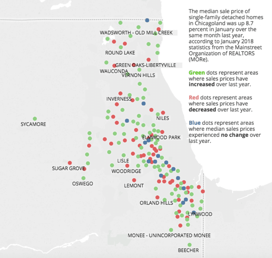
Source: Mainstreet Organization of REALTORS®
MORe also shares monthly infographics on their social media channels, which reach a different segment of their target stakeholders than the Tableau visualizations. Your organization can create quick, easily digestible social images like this using tools like Canva or Piktochart.
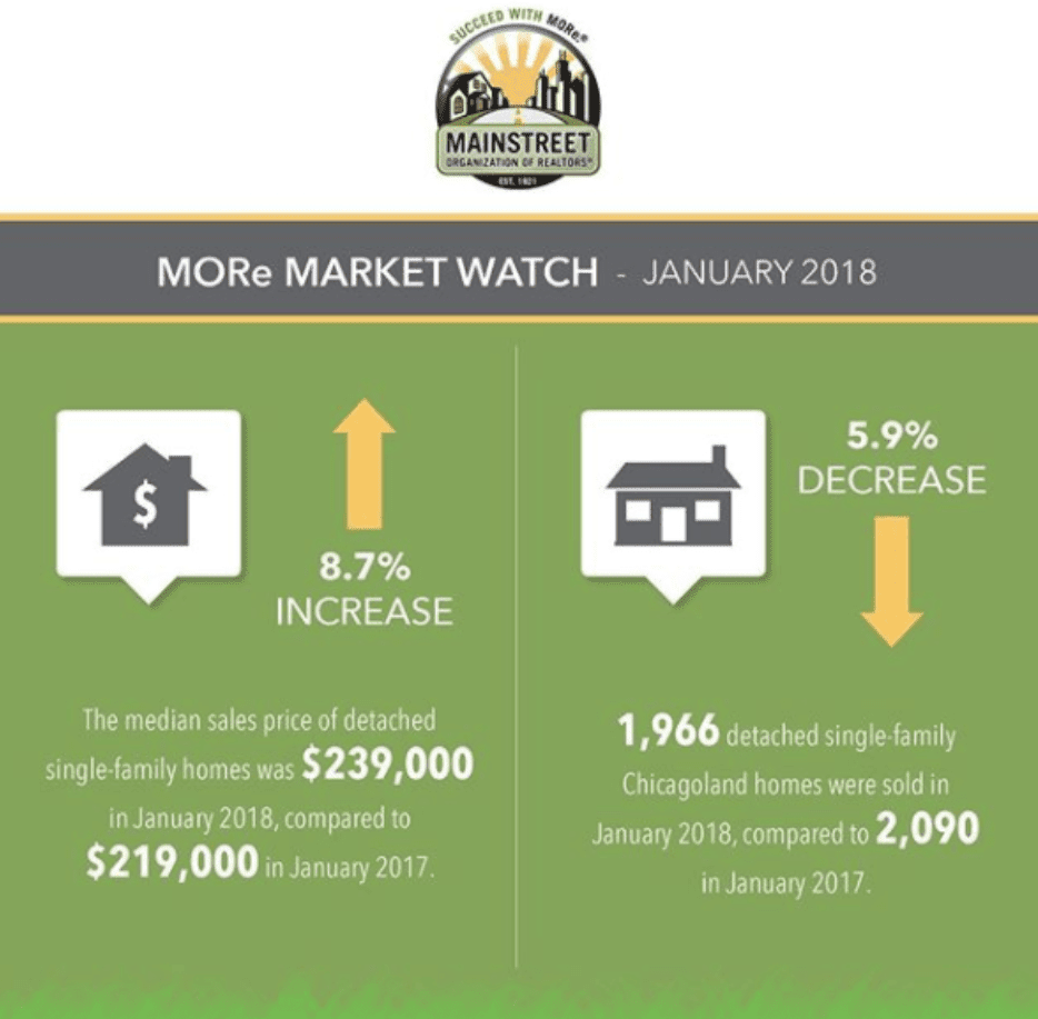
Source: Mainstreet Organization of REALTORS®
Additionally, our client Nonprofit HR conducts an annual Nonprofit Employment Practices Survey, which they then share on a designated interactive data portal on their website. The interactive data portal allows Nonprofit HR to communicate results of the survey in coherent, digestible graphs and summaries. As a result, Nonprofit Employment Practices Survey data has been featured in national media outlets like Fast Company and Nonprofit Quarterly.
Source: Nonprofit HR