
Building a nonprofit website that really works is not as complicated as it might seem. As we shared in our last post in this series, there are just four essential elements every nonprofit site needs to succeed (this post covers #2 of 4). They are:
- A Well-Structured Homepage With Clear Messaging
- An Easy Opt-In (read on)
- Illustration of Impact (post coming soon)
- A Way to Donate and/or Get Involved (post coming soon)
Nonprofit Website Essential Element Two: An Easy Opt-In
Most first-time visitors to your site won’t be ready to take a “high value” action like making a donation, signing up to volunteer or enrolling in one of your programs or services. That’s why having an easy opt-in form on your site is so essential. An opt-in form is simply a way to capture your visitor’s contact information early in their journey through your website so that you can continue to communicate with them and nurture them toward the action you want them to take, even after they leave your site.
Let’s look at a few examples of opt-ins on nonprofit websites and dissect their content, placement and user-friendliness.
Opt-In Option 1: The Newsletter Subscribe Form
Nonprofits have been using newsletter and email subscribe forms to capture contact information from their website visitors for a long time, and they’re still one of the most popular low-value website opt-ins for a reason: they work. Here are some examples:
BuildOn’s Newsletter Opt-In form
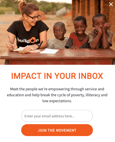
BuildOn has a call-to-action to sign up for their emails in several prominent places on their site, including midway down their homepage, and in a popup box that appears five seconds after a new visitor arrives at their site. Language is key here. While filling out this form does nothing more than subscribing a user to BuildOn’s email list, the button copy that reads “join the movement” makes it feel like so much more.
Alex’s Lemonade Stand Foundation’s Newsletter Opt-In Form

Alex’s Lemonade Stand Foundation has a strong brand personality that shows through even in their newsletter opt-in form, which (like BuildOn’s) appears at the approximate mid-point of their homepage. They also include the same form, along with a bit more copy, in the footer of every page on the site:

YWCA’s Newsletter Opt-In Form
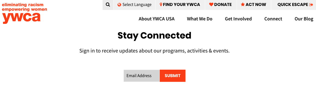
YWCA keeps it simple with a single field form that asks visitors to enter their email address in order to receive updates about programs, activities and events. This form appears as the fourth content block on their homepage. They could make this form convert far more contacts by also placing it in their footer or on key pages of their site such as the blog and get involved pages.
Each of these newsletter subscribe forms is kept exceedingly simple, with only a single field (email) for the user to complete. Making it as easy as possible for a visitor who doesn’t yet have a relationship with your organization to join your list is essential, and limiting your form to one field will greatly improve your conversion rate.
Opt-In Option 2: The Engagement Form
While newsletter/email subscribe forms are the most common type of low-value opt-ins found on nonprofit websites, they’re certainly not the only one. Organizations like Feeding America, Greenpeace and ACLU all offer ways to engage more deeply with their mission through their opt-in forms, from downloading a free guide to signing a pledge.
Feeding America’s Engagement Opt-In Form
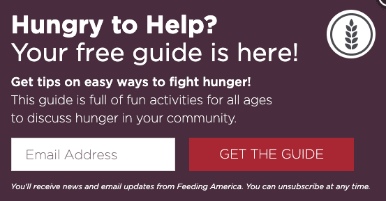
Feeding America created an engaging guide for those who are interested in learning about ways to fight hunger in their own communities, and website visitors can download it by simply providing their email address. This approach is effective because it captures contact information for those who have the potential to become donors, volunteers and sponsors, but aren’t yet ready to make that commitment and want to learn more. Notice that Feeding America is clear that filling out this form will subscribe the user to their email list, but that the user can unsubscribe at any time.
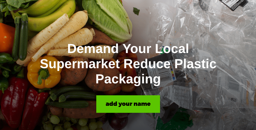
Greenpeace’s Engagement Opt-In Form
The very first block of content on Greenpeace’s site is a call-to-action to sign a petition to demand your supermarket reduces plastic packaging:
This same call-to-action appears in a popup box after a new user spends 60 seconds or more on the site:

It seems that Greenpeace changes out these petition-style engagement opt-ins often in order to touch on different aspects of its mission and interests of different types of visitors.
ACLU’s Engagement Opt-In Form
ACLU uses two different types of primary opt-in forms in tandem on their homepage. The first is a standard newsletter subscribe opt-in, while the second is a pledge to defend abortion rights (similar to Greenpeace’s petition approach). Again, this works well because people who care to sign the pledge are likely to closely match the profile of prospective donors and volunteers, and can be nurtured toward giving or volunteering with emails and other communications from ACLU.
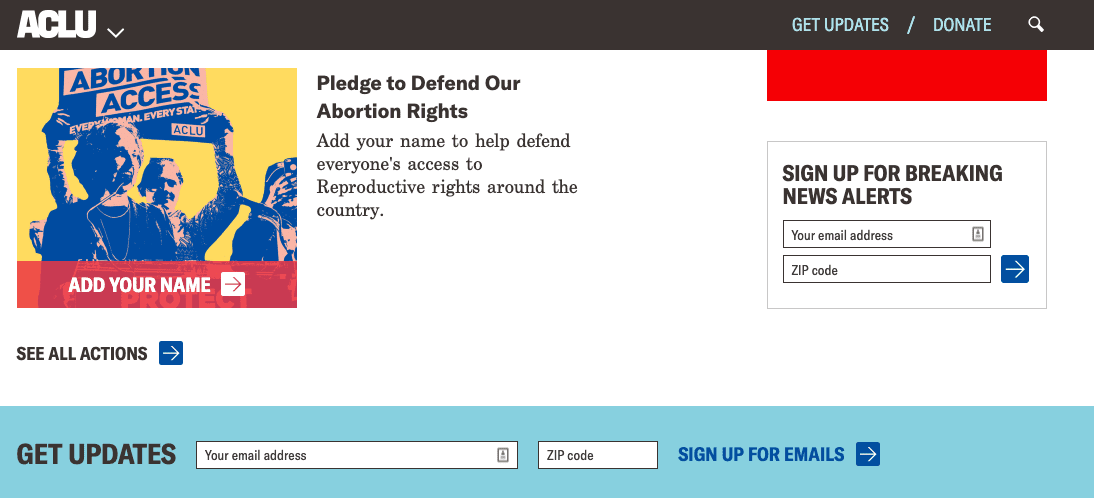
If you ask me, engagement opt-ins are more effective than newsletter opt-ins, because, by their very nature, they filter for website visitors who are likely to have interest in getting involved with your organization in some way. They also feel like a more worthwhile reason to give over an email address for many visitors.
Opt-In Option 3: The Big Ask
At the start of this post, I mentioned that most first-time website visitors aren’t yet ready to donate or sign up for services, and while that’s true most of the time, it isn’t a hard and fast rule. If your organization already has strong brand awareness and affinity, you may actually be able to compel visitors to donate right out of the gate. Similarly, if most visitors to your site come ready to find out how to take advantage of a specific program or service that they already know about, you may be able to compel them to sign up on the spot. Let’s take a look at a few examples of organizations that make big asks like these as their primary opt-ins.
charity: water’s Big Ask Opt-In Form
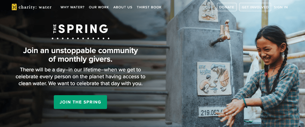
The very first block of content on charity: water’s site is a call to action to join their monthly giving program, which they call The Spring. This seems to work for them, but they can only get away with it because they’re charity: water. I wouldn’t try this approach unless your organization is already extremely well-known and trusted among those who end up at your site.
Malala Fund’s Big Ask Opt-In Form
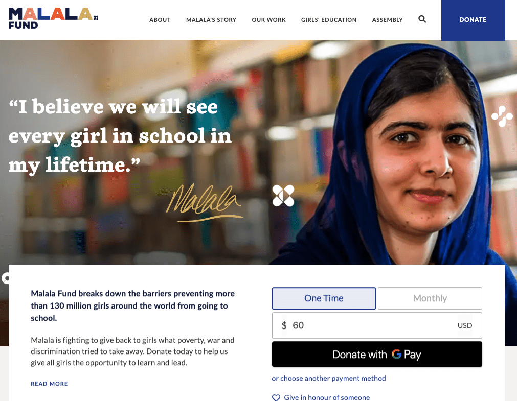
A second example of a prominent organization that makes a donation ask straight out of the gate is Malala Foundation. I like their donation opt-in even better than charity: water’s because the form lives right on the homepage rather than behind a button that directs to a separate page. Again, they can get away with making a donation ask their opt-in because their organization has already built a lot of trust with its stakeholders.
American Red Cross’ Big Ask Opt-In Form
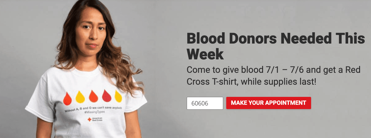
American Red Cross likely made the decision that given their model and mission, a call-to-action to donate blood should take priority over a call-to-action to subscribe, donate or download content, so that takes the place of a traditional opt-in form on their website. Much like the two big ask examples above, this call-to-action requires strong brand awareness and affinity to be successful.
What is your site’s primary opt-in, and how is it working for you?
We’d love to hear your thoughts in the comments.
Stay tuned for the next two posts in this series, where we’ll dive into the remaining essential elements of an effective nonprofit website.
Until part three, take a look at our Nonprofit Marketing Manifesto.