
Why do some nonprofit websites succeed while others fail?
It comes down to much more than beautiful imagery and clean, user-friendly design. In fact, there are four elements that every nonprofit website needs to have to achieve its full potential, and most organizations miss at least one of them. Over the course of four posts in this series, I’ll break these four elements down so that you can start auditing your website for them and optimizing it accordingly. They include:
- A Well-Structured Homepage With Clear Messaging (read on)
- An Easy Opt-In
- Illustration of Impact (post coming soon)
- A Way to Donate and/or Get Involved (post coming soon)
Nonprofit Website Essential Element One: A Well-Structured Homepage With Clear Messaging
The homepage is the most visited page on most nonprofit websites, so getting your homepage design and content right is critical. Luckily, it’s more straightforward than you might imagine. The best nonprofit homepages include just five blocks of content, which should (usually) be delivered in the order shown here.

Let’s unpack each of these with an example from BuildOn.org, an extremely effective nonprofit website.
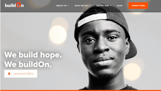
Mission
Everything your organization does stems from its mission, and as the digital “face” of your organization, your homepage should be no different. While you don’t need to state your mission word-for-word on your homepage, the first block of content that appears under your navigation should allude to it in a way that gets visitors excited about the change you exist to drive and pulls them in to learn more.
Here’s how BuildOn does it:
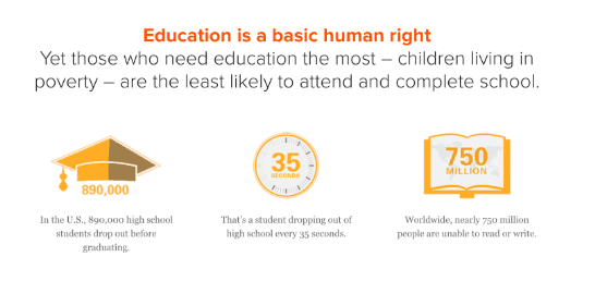
Ill & Cause
At Prosper Strategies, we often use a messaging framework called IC3, which stands for ill (the problem you exist to solve), cause (what causes the problem), cure (what will solve the problem), consequence (what will happen if you do or do not solve the problem). The second block of your homepage should focus on the first two parts of that framework: the ill and the cause.
Here’s how BuildOn sets up the ill (lack of education) and the cause (poverty) in the second block of content on their homepage:
Cure & What We Do
The third block on your homepage should detail the cure to the ill, and what your organization does to advance the cure. Here’s how BuildOn does it:
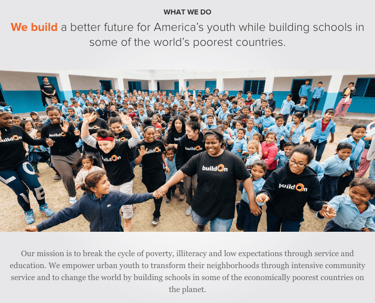
While the messaging in this section is concise and clear, this section would have been even more effective if BuildOn provided a few specific examples of their programs both in the U.S. and globally.
Proof of Impact
Once your audience makes it to the fourth block of content on your homepage, they’ll have a basic understanding of the problem you exist to solve and the work you do to solve it. Now, it’s time to show that what you do works through proof of impact. Some of your stakeholders will likely respond better to stories as proof of impact, while others will respond better to stats and data. We suggest using both in this section of the homepage.
Here’s how BuildOn does it:
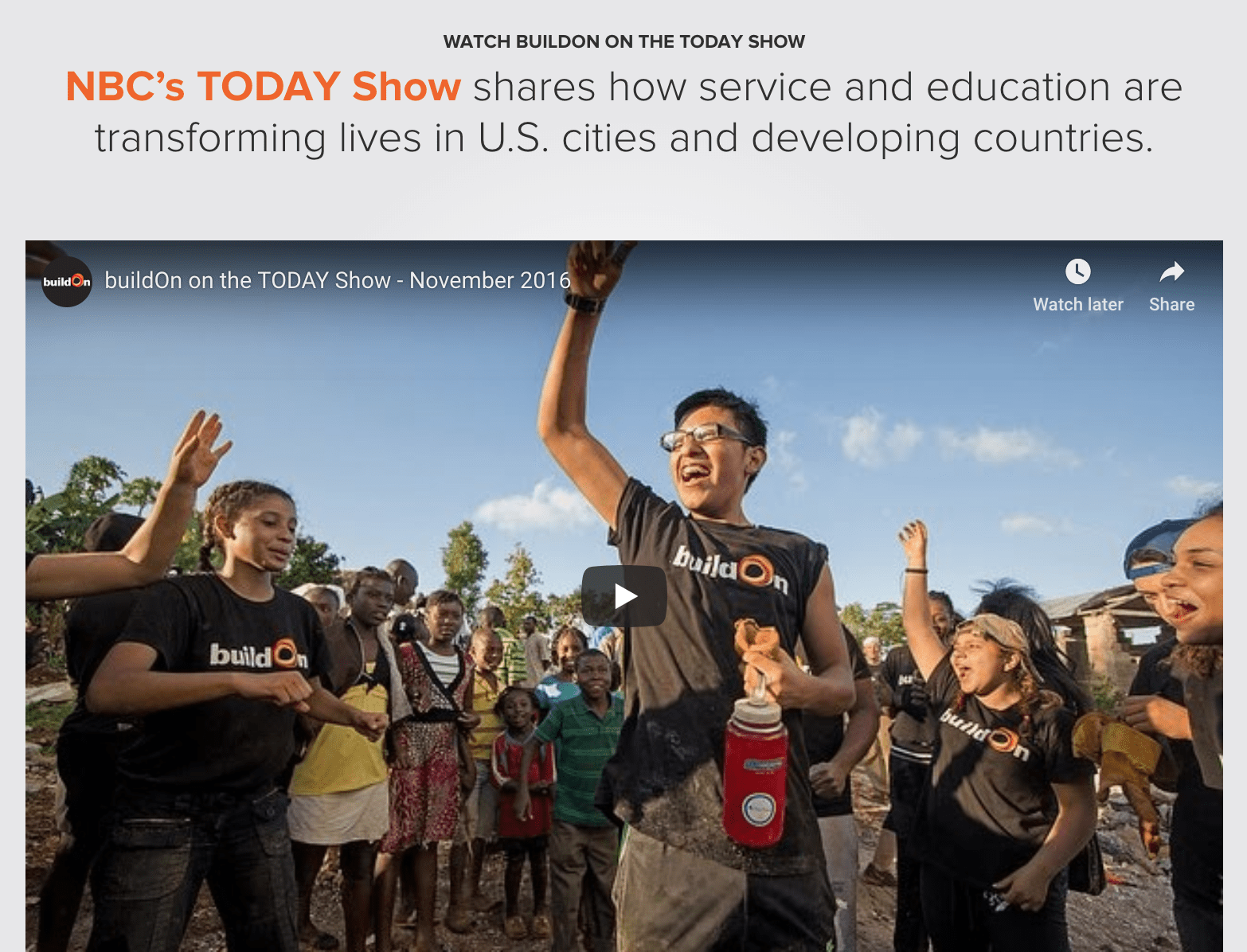
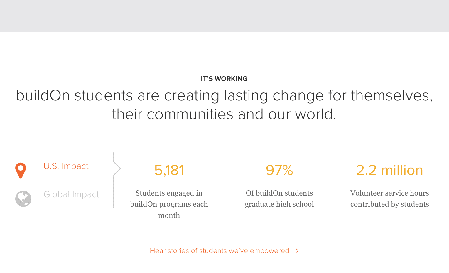
Their proof of impact section is especially effective because it uses third party validation through a clip from NBC’s TODAY Show, which adds instant legitimacy to their impact and illustrates it in a dynamic, visual manner. We also like the way they broke up their impact stats into two buckets that users can toggle between: U.S. and Global.
Call(s)-to-Action
Ultimately, your homepage exists as the entry point for an intentional journey you will take your stakeholders on. That’s why it’s critically important to include a clear call-to-action for the next logical step you want your visitors to take in this journey. Ideally, your homepage would have just one single call-to-action so that visitors don’t have to make too many choices and are led down a clear path designed by you. However, due to the various different groups of stakeholders most nonprofits need to reach, engage and influence, including just one call-to-action often isn’t feasible. To figure out what the calls-to-action on your homepage should be, ask yourself: who are the most important stakeholders our website needs to reach, and what do we want each of them to do after they visit our homepage? Then, create calls-to-action that send them to that next step.
Here’s how BuildOn does it:
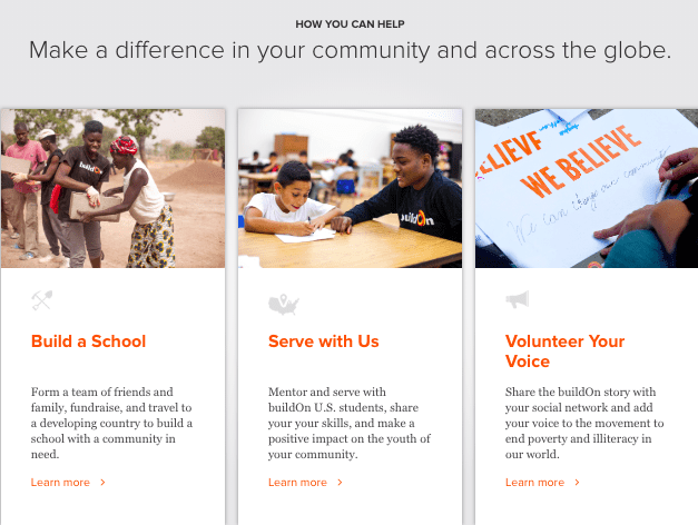
BuildOn likely made the decision that their homepage needs to influence three different types of volunteers: those who want to build schools globally, those who want to mentor youth in the U.S., and those who simply want to advocate for the cause. There is a call-to-action for each of these groups that sends them off on a journey through the website intended to ultimately drive them to take action. While this approach is effective, having a single call-to-action to get involved on the homepage and then leading visitors to another page where they could select from the three paths above might have been an even better approach.
By now, you’re probably getting the sense that an effective nonprofit homepage requires getting crystal clear about your organization’s positioning and messaging. If you’re struggling in those areas, we can help.
Stay tuned for the next three posts in this series, where we’ll dive into the remaining three essential elements of an effective nonprofit website.
Until part two, take a look at our Nonprofit Marketing Manifesto.