An effective nonprofit website doesn’t come together by accident. The best sites are the result of careful planning and intentional decisionmaking. As we’ve covered in past posts in this series, the most effective nonprofit websites include these four elements:
- A Well-Structured Homepage With Clear Messaging
- An Easy Opt-In
- Illustration of Impact
- A Way to Donate and/or Get Involved (read on)
While those first three elements are important, they’re of little use without the fourth. If your website visitors can’t quickly figure out how to donate or get involved in your organization, you may lose them forever.
So how can you ensure your organization is making it as easy as possible for visitors to donate or take action? Here are a few best practices.
Make The Donate Button Part of Your Top Navigation
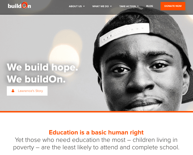
Your website’s top navigation bar is the primary spot most web visitors will look to when figuring out where to go next on your site. Don’t miss the opportunity to make a donation page one of their primary options.
BulidOn does this well, with a Donate Now link that sits alongside other top navigation items, but stands out because it’s bright orange on a gray field.
Provide Different Options for Different Types of Supporters
Your organization likely has many different types of donors and supporters, and your website will be more effective if it acknowledges the unique nuances between them.
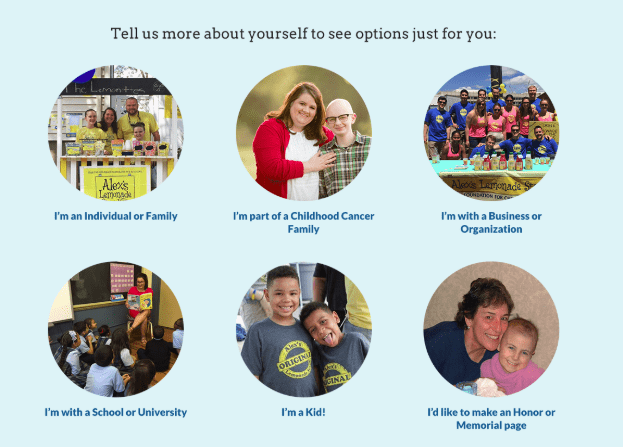
Alex’s Lemonade Stand Foundation does a great job at this. On their Get Involved page, visitors can self-select the type of supporter they are (individual, business, kid etc.) and see personalized options for starting fundraisers, donating, and getting involved that are tailored to them.
Make Your Ask Timely
According to npENGAGE, “most nonprofit websites see a donation form abandonment rate of around 50% – 70%. Yes, that’s more than half of the people who have found your website, gotten interested enough to click the ‘donate now’ button and looked at the donation form decide not to make that donation.” Ouch. So how can you combat donation abandonment? One best practice is to make your ask timely.
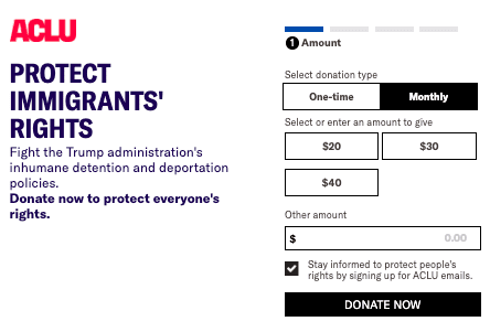
No one does this better than ACLU. A few seconds after arriving to their site, visitors are greeted with the pop-up shown below that encourages them not just to “donate to ACLU,” but to “Protect Immigrants’ Rights,” the top issue likely to be on the minds of most visitors today. ACLU is pointed and direct in their ask. They position a donation as a fight against the Trump administration’s inhumane detention and deportation policies, and they make it possible to donate without leaving the popup window that appears on their homepage.
Provide Other Ways to Give
54 percent of donors prefer to give online with a credit card, and most nonprofits tend to focus on optimizing the user experience for those donors. However, that leaves behind the 46 percent of donors who prefer other methods of giving, but may still do research into your organization using your website.
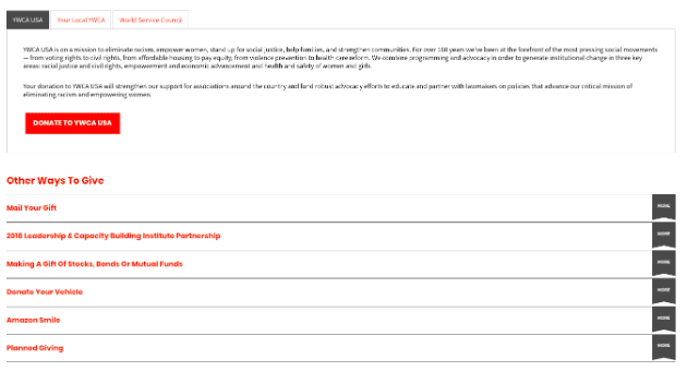
Follow YWCA’s example and make sure your website is well-positioned for both online and offline donors. YWCA provides detailed information on other ways to give, including mailing your donation, making a gift of stocks, bonds or mutual funds, using Amazon Smile or engaging in planned giving.
Make it Mobile
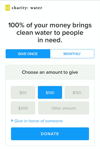
Mobile giving reached an all-time high in 2018, when 24 percent of online charitable donations were made from a mobile device. The importance of optimizing your site (and especially your donation flow) for mobile cannot be overstated. Charity: water’s mobile donation page is a great example of a clean, fast-loading donation page that was designed specifically for mobile and allows users to donate with just a few taps of a finger. While charity: water’s donation page allows for credit card and PayPal donations, you may also want to consider integrating with Apple Pay to make it possible for iPhone users (over 50% of all smartphone users) to donate without entering any payment information.
If you’re looking for more tips on optimizing the ways you ask your website visitors to donate and take action, this post is a great resource.
You now have all the insights you need to create a website that truly works for your nonprofit. So what are you waiting for? Start restructuring your homepage, developing your opt-in, illustrating your impact and making it easier for donors to donate and get involved today. Your website visitors will thank you, and so will the causes and communities you serve.
